Graphic design is important because we judge based on appearance a lot of the times. For example, when we go to a library to pick out a book, we choose the book that has a front cover illustration that catches our attention. The images and colors used for a brand is as important for it’s advertisement as the product itself. When we see the logo design for Apple it gives us a high-class, futuristic feel. When we see the logo design for Adidas, we know it’s Adidas by the black and white stripes formed as a triangle. The propose of graphic design is to create images that grab people’s attention, evoke emotion, and is memorable.
Affinity
The software I used to create my favicon and header was Affinity. After watching the videos that were inserted in the module, I learned a lot about the software and wanted to try it for myself. The platform seemed to have a variety of editing tools that would be useful for my creations. The platform was also easy to download and access with it being free of charge. Even though I had some difficulties using Affinity, it had a help tool and feature finder that was of great help throughout my process of creation.
Images Created
At first I wasn’t sure what theme I wanted to go for. It was especially challenging because this was the first time I used Affinity and didn’t fully know how to navigate the tools. I honestly just went in and did some experimenting with the tools then decided it was way easier dealing with the shapes than the pencil, pen or paint tool. For a beginner, I think that was the best option for me.
Favicon

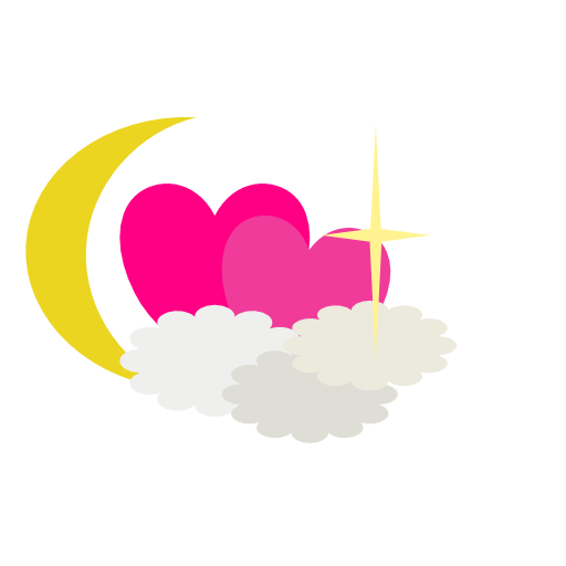
For my favicon, I decided on a dreamy-like theme. It was pretty different from my site’s theme before which was more of a calm, mysterious-like theme. The reason I decided to have this type of theme for my favicon was because in my website, I showcase my thoughts, ideas, and creations which is from my imagination. I relate imagination with dreams because both rely on the brain’s power to produce images, stories, and thoughts. I started out with two hearts and decided to add clouds over them and a crescent moon on the side. This made it look dreamy and magical at the same time. Afterwards, I still felt like something was missing, so I finally decided to add a big sparkle on one of the hearts to give it more detail.
Header Image

Making my header image took way longer because I was initially trying to use different tools. I started out using the pencil tool to create mountains because I wanted to make something more artsy. However, it ended up not looking good. I started to accept that as a beginner, I should stick to something easier so that my website doesn’t end up looking messed up. I then decided to use different shapes like the spiral shape for my image because I wanted my header to look interesting and a little unique. When I finished and edited it on my website front page, I realized that my image looked too different from my favicon and lacked visual harmony. I hated how it looked so I decided to delete it and create a header image that looked more similar to my favicon so the theme would be cohesive. Even though I stuck to shapes, I still used new features I didn’t use before for my favicon like the knife tool. I used that tool to help create the crown. I also used the frame text tool to type, “Welcome to Mariam’s Blog Page” in the center.
Process
Like I stated before, I only used shapes to create my images. However, I used other tools and techniques in Affinity to get my end results. For the favicon, I changed the sizes of the shapes and used the “arrange” tool to put some shapes behind or in front of each other. For the crescent moon, the app gave me the ability to edit the curves on the moon so I took advantage of that to make the moon look the way I wanted it to look. For the sparkle, I used two diamonds, narrowed them, changed the lengths, rotated one and put it on top of the other one. I used the same technique for the sparkles for my header image. And of course I used the color feature to choose the colors of my shapes. I used two tools on my header image that I didn’t use on my favicon: the knife tool and the frame text tool. I used the knife tool to cut a star in half then deleted the bottom part of it and added two triangles to it to create a crown. The frame text tool was used to put “Welcome to Mariam’s Blog Page” and I also changed the font. I ended up transferring both the images into PNG because it just turned out looking better that way. When I tried JPEG it looked a little blurry to me. When making sure the images came out clear and the right size, I just experimented with the pixels. In the end, my favicon was 512px x 512px and my header image was 1200px x 1200px.
Conclusion
This assignment definitely showed me how hard and time consuming digital creation can be. Finding the best platform and also navigating it for the first time was challenging. Throughout the creation, I had to keep in mind of my website’s appearance and how it would be perceived by others. My goal was to make my website look nice and become memorable, not only for my posts, but for the design as well. Experiencing graphic design taught me the importance of images, colors, sizes, and pixels and how that can really effect how something is perceived.

Leave a Reply